When Our App Got Copied: Repscroll vs FitScroll
A public, evidence-based look at the timeline, screenshots, onboarding flow, and App Store listing similarities we submitted to Apple.
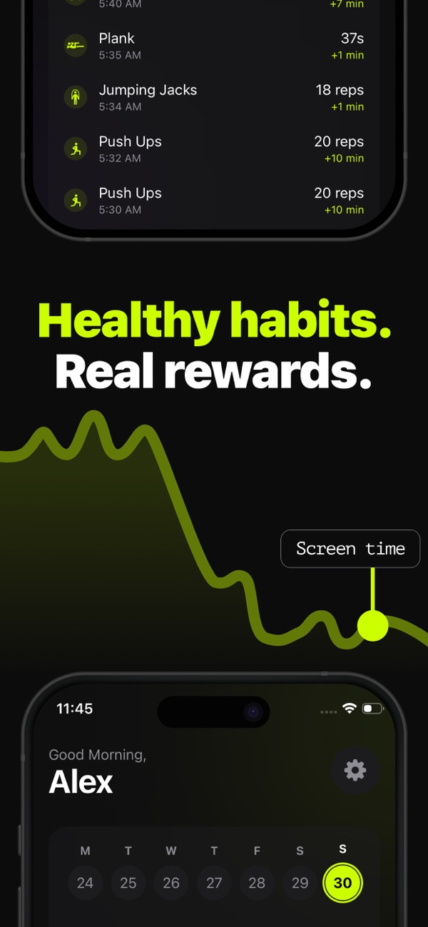
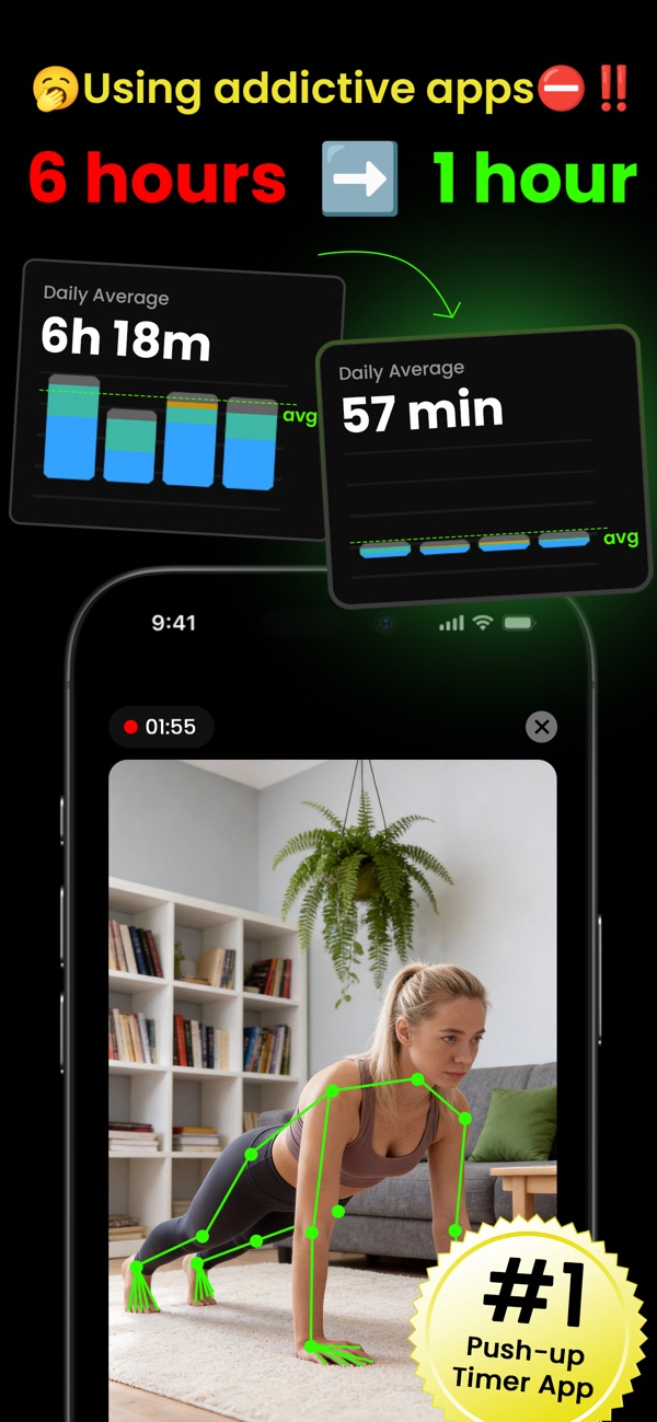
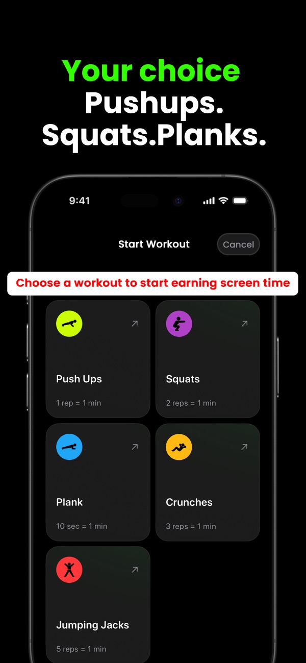
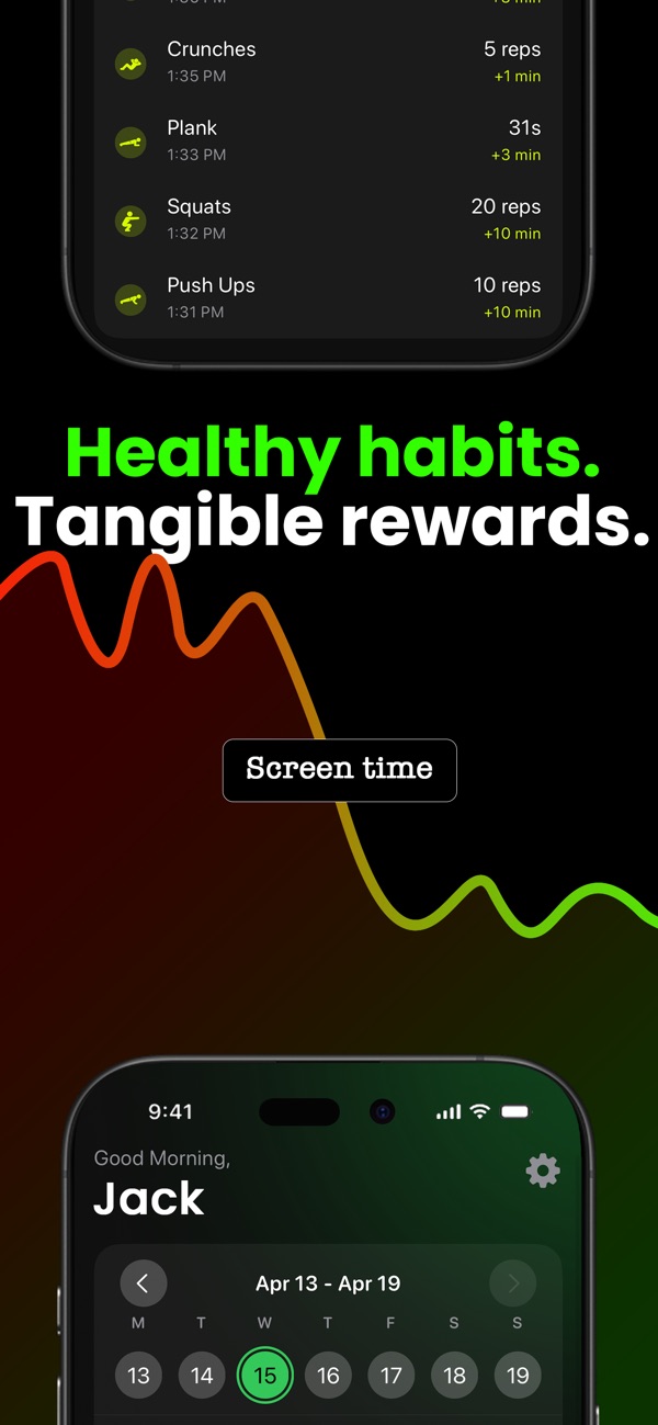
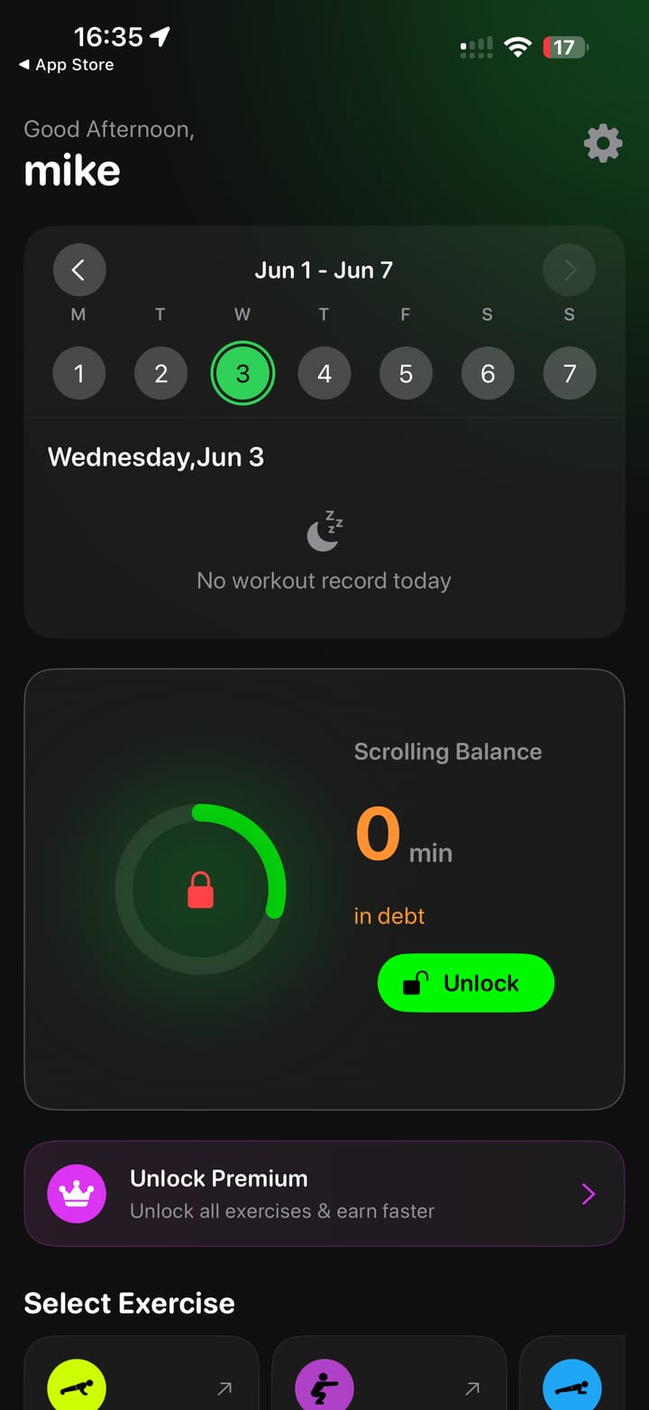
Repscroll is our iOS app for people who want to earn screen time by doing real exercise. The product idea is simple: choose the apps that pull you in, complete an AI-tracked workout, then unlock access you have earned.
In April 2026, another app called FitScroll appeared on the App Store with the same core promise and a long sequence of similar product, listing, and onboarding choices. We prepared an evidence packet and submitted it to Apple. This post is the public, HTML version of that story.
We are not saying nobody else can build an exercise-based screen-time app. We are saying the pattern here goes far beyond a shared category idea.
This article summarizes evidence captured for our Apple submission on June 3, 2026. The App Store dates and listing details come from public Apple lookup data. The screenshots come from public App Store pages and app flows captured for the evidence packet.
The timeline matters
The public App Store data shows Repscroll was released first, then FitScroll was released several months later.
| Field | Repscroll | FitScroll |
|---|---|---|
| App name | Repscroll: Push Up Screen Time | FitScroll -Screen Time Control |
| Developer | APPIKO LTD | Apple artist ID 1804224318 |
| App Store ID | 6755953205 | 6762172618 |
| Bundle ID | co.appiko.repsforreels | com.lzrr.Pushup |
| Release date | December 9, 2025 | April 29, 2026 |
| Version reviewed | 2.1.15 | 1.0.1 |
| Version date | May 14, 2026 | May 21, 2026 |
That timing does not prove every sentence or screen was copied by itself. It does support treating Repscroll as the earlier public product for this comparison.1
The icon concept is not just the same category
Both apps use a centered muscular animal mascot holding a phone with a lock concept and bright neon treatment. FitScroll changes the animal, but keeps the same visual role: mascot, phone, lock, glow, and app-icon framing.
On its own, an icon similarity might be debatable. Combined with the rest of the app, it becomes part of a larger pattern.
The App Store screenshots follow the same playbook
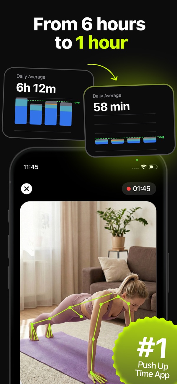
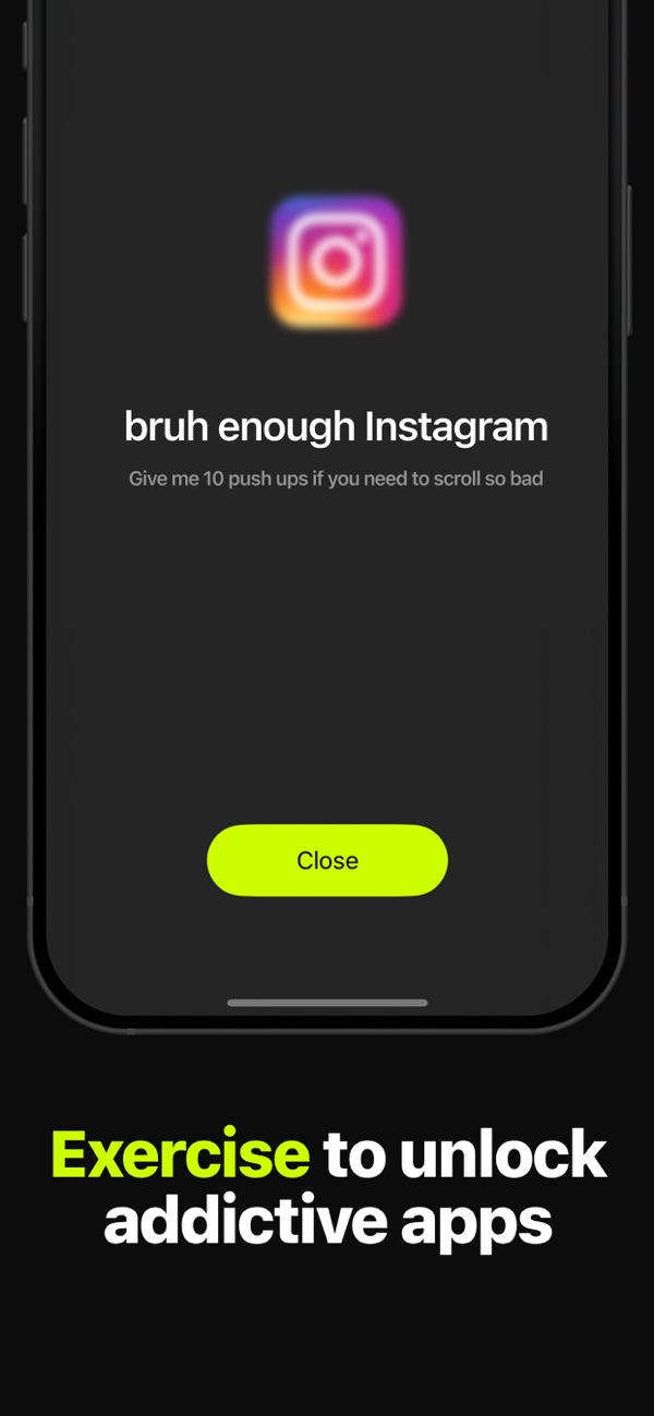
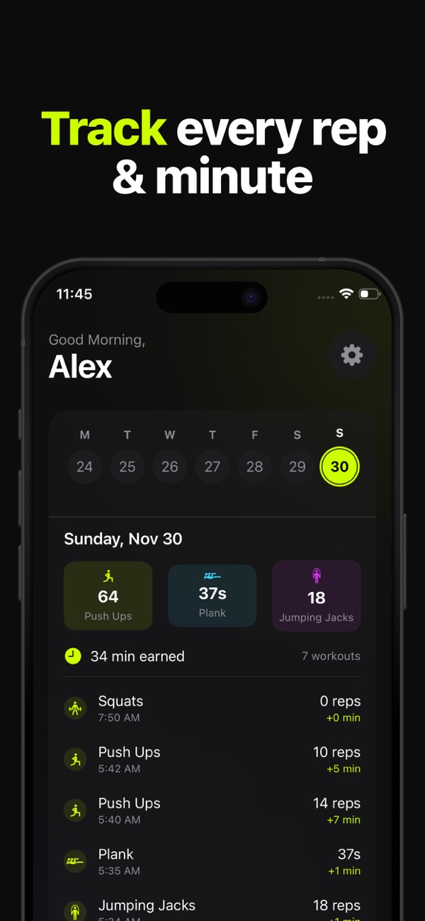
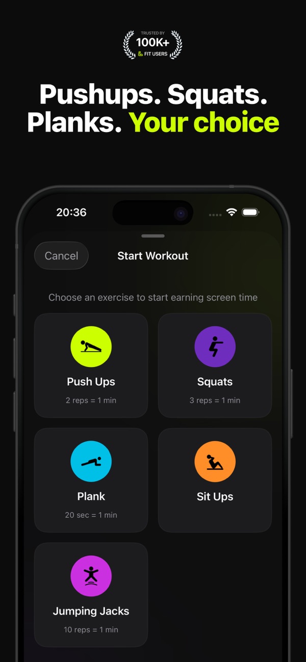
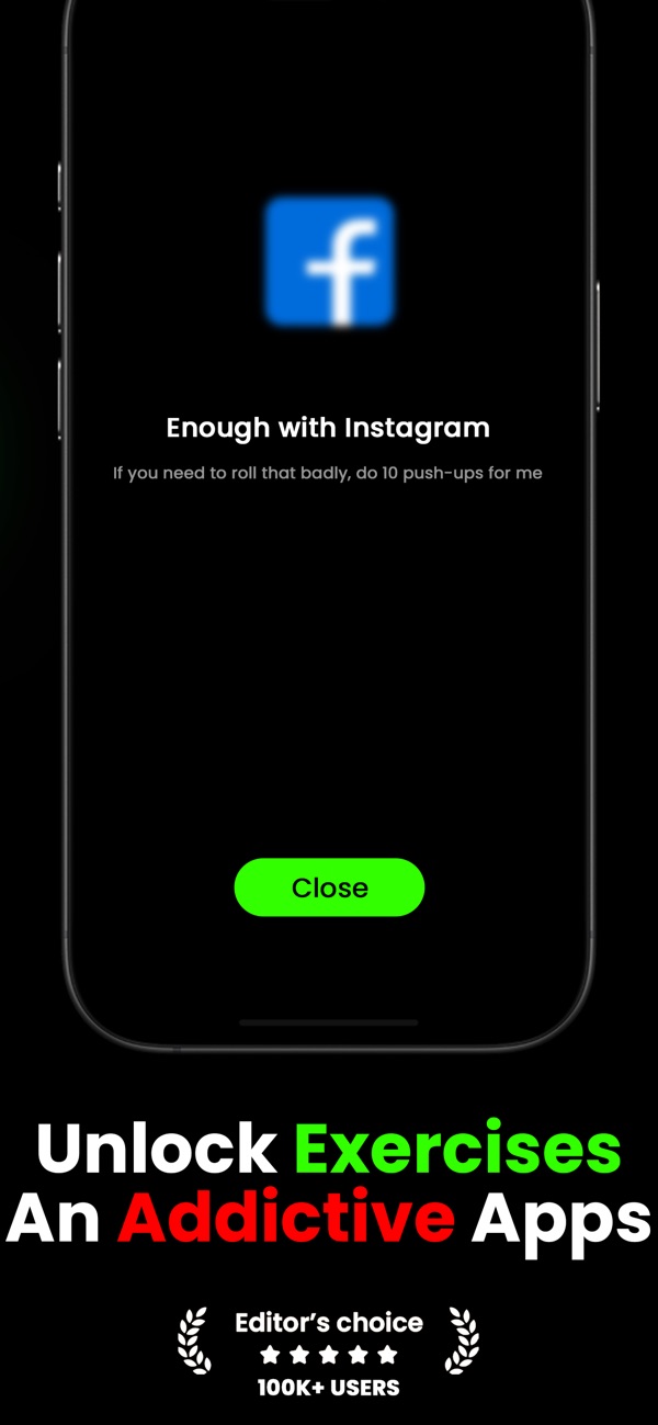
The five public iPhone screenshots also follow a very similar order and message arc: exercise-for-screen-time premise, blocked apps, camera-based rep counting, reward unlocking, and progress or outcomes.
Repscroll App Store screenshots
FitScroll App Store screenshots
The listing copy also uses the same structure: value proposition, how-it-works steps, short exercise/scroll slogans, feature list, subscription/legal block, and contact details.2
Examples we included in the evidence packet:
| FitScroll phrase | Matching or near-matching Repscroll concept |
|---|---|
| "earn screen time by completing real exercises" | Same core opening sentence in Repscroll |
| "unlock the apps you love" | Same phrase in the Repscroll opening paragraph |
| "Break the scroll habit" | Same anti-scrolling concept and wording |
| "AI pose detection" | Same AI-tracked exercise feature category |
The normalized similarity across the full public descriptions was lower than a direct copy-paste because subscription text and legal blocks add noise. In the core marketing copy before those blocks, the similarity was substantially higher in our comparison.
The onboarding flow is the strongest evidence
The clearest pattern is the onboarding. Our packet mapped 31 Repscroll onboarding screenshots against 31 FitScroll screenshots by visible screen context, not by automatic text extraction. The sequence repeats the same broad structure: opening promise, name and age collection, habit questions, app selection, scrolling psychology, goals, social proof, phone usage, daily screen-time target, life remaining framing, exercise/scroll education, permissions, loading testimonials, and a final personalized plan.
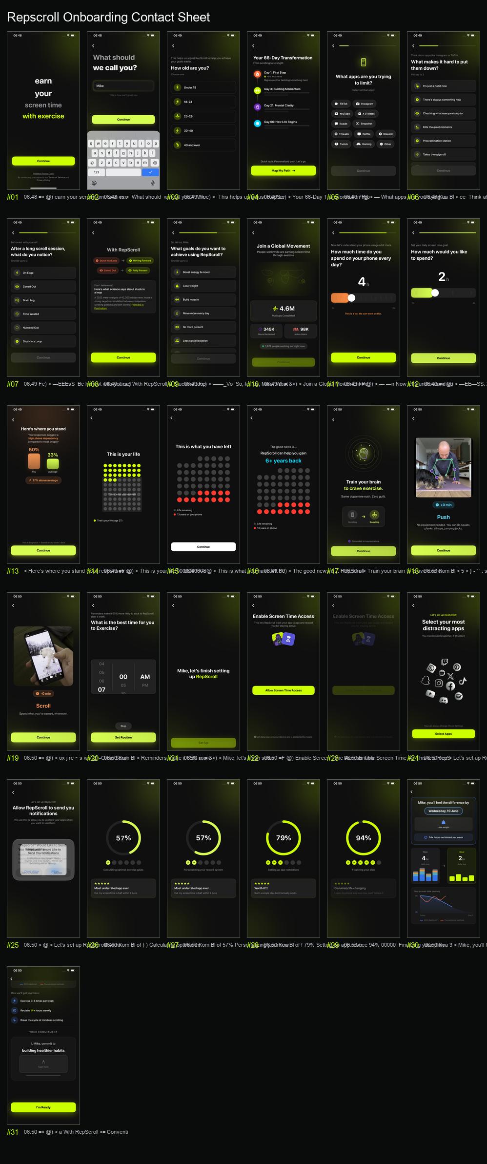
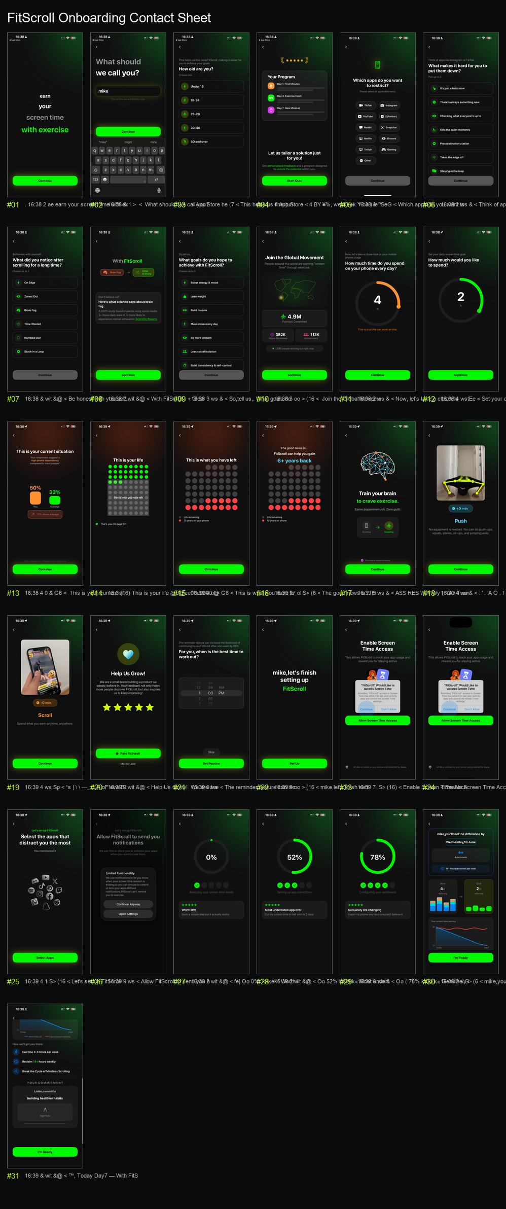
Several screens are especially direct:
| Sequence area | What repeats |
|---|---|
| Opening screen | Centered stacked "earn your screen time with exercise" promise |
| App selection | Same limited-app setup using TikTok, Instagram, YouTube, X, Reddit, Snapchat, Netflix, Discord, Twitch, Gaming, and Other |
| Habit questions | Same framing around Instagram or TikTok, novelty, checking what everyone is up to, quiet moments, procrastination, and taking the edge off |
| Goals | Same goal set: energy and mood, weight loss, muscle, moving more, presence, and less social isolation |
| Social proof | Same "Global Movement" concept with pushups completed, hours reclaimed, active users, and live workout count |
| Screen-time setup | Same phone-usage question, daily target question, dependency comparison, and life remaining framing |
| Permissions | Same Screen Time access flow, app selection setup, notifications prompt, loading/testimonial sequence, and final plan |
One or two matching screens could be coincidence. A long sequence with the same ordering, copy structure, UI hierarchy, and emotional framing is much harder to explain away.
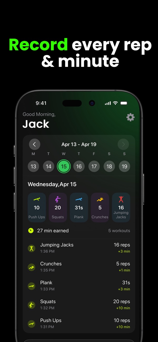
The app itself keeps going
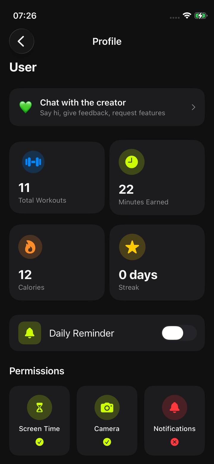
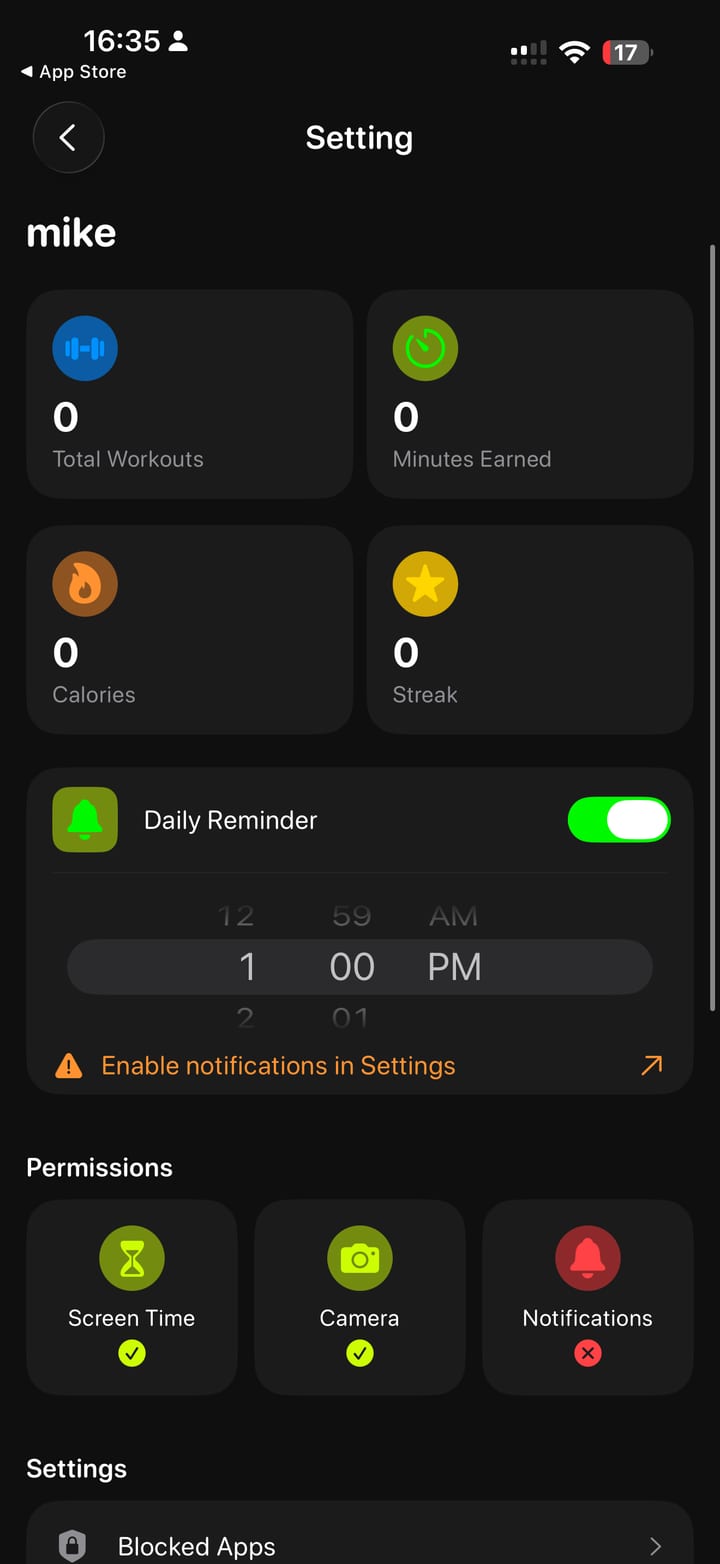
The similarity was not limited to marketing. The evidence packet also compared dashboard, settings/profile, and paywall screens. The repeated pattern is the important part: same dark visual direction, same neon accent language, same top dashboard structure, same screen-time balance card, same unlock action, same settings/profile layout role, and same paywall structure.
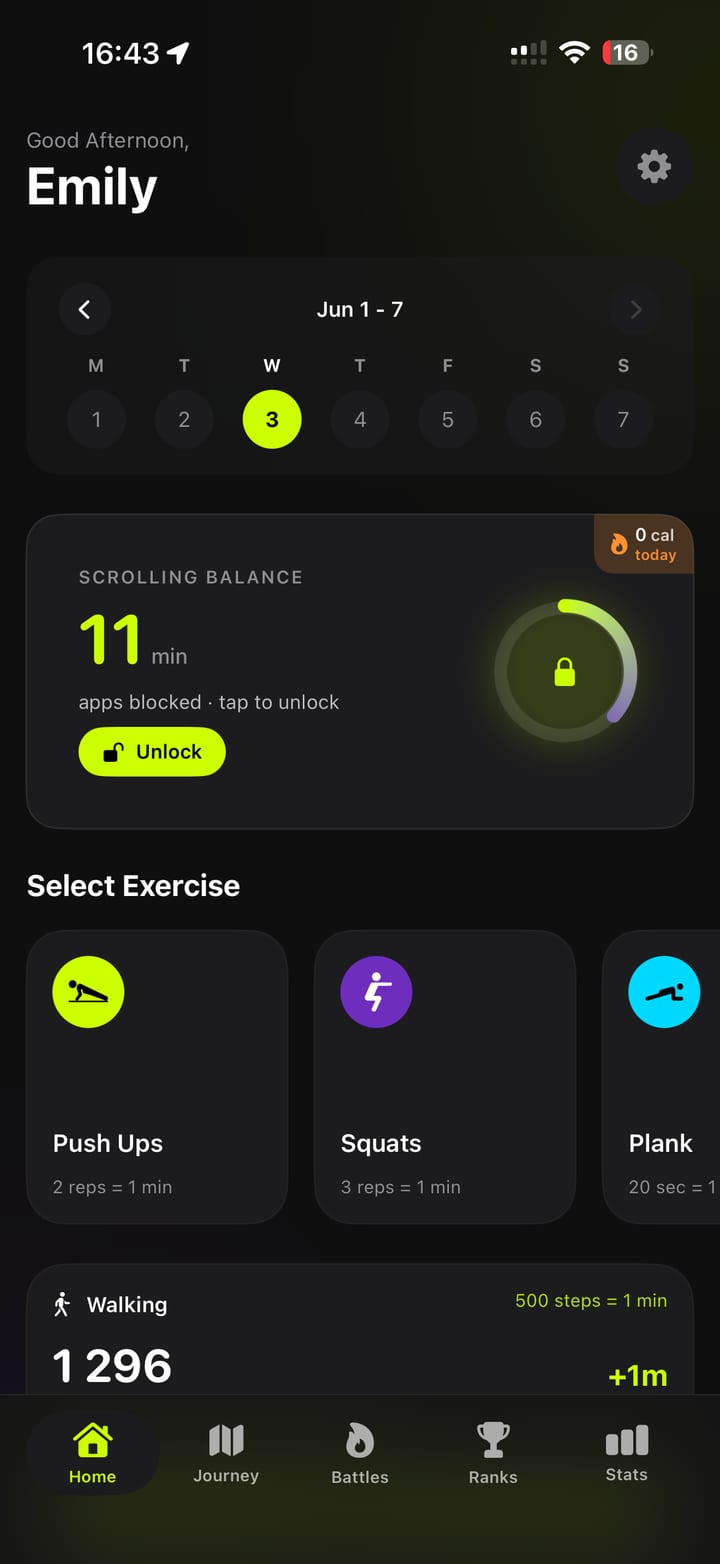
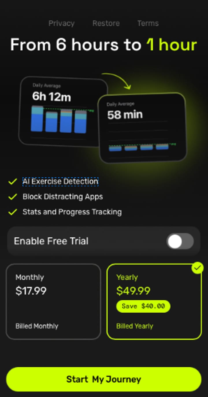
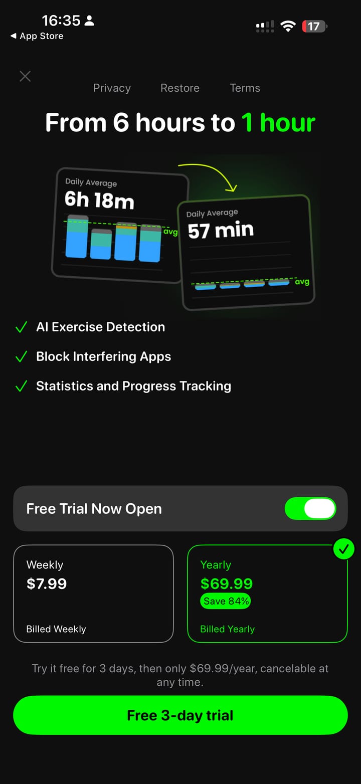
The paywall comparison is a good example of how this works. Both screens lead with the same claim structure around reducing daily usage, both use before/after screen-time graph cards with a green arrow between them, both list three benefits with green check marks, and both place a free-trial toggle above plan cards.
What we asked Apple to review
We asked Apple to review the current app and listing as one cumulative pattern, not as isolated screenshots. Our requested outcome was simple: do not treat the issue as resolved unless the copied experience is substantially and verifiably replaced.
For us, the strongest evidence is the combination:
- Repscroll's earlier public release date.
- A similar icon concept and storefront presentation.
- A similar App Store screenshot order.
- A public description with the same core promise and structure.
- A 31-screen onboarding sequence with matching flow, framing, and screen roles.
- Similar dashboard, settings/profile, and paywall structures.
This is why we submitted it to Apple, and why we are publishing the evidence in a format people can review without opening a PDF.
Why this matters
Small teams spend real time designing the things that look simple from the outside: onboarding order, screen-time psychology, reward framing, permission timing, paywall structure, and how the whole product feels. That work is part of the product.
Competition is good. Similar categories are normal. But when a later app follows the same public listing, the same onboarding journey, the same emotional sequence, and the same core screens, it crosses a line.
We will keep building Repscroll. We also think developers should be able to defend their work publicly, with evidence, when that work is copied.