When Our App Got Copied (Yes, Again): RepScroll vs RepLock
A second evidence-based comparison: 80 classified observations across 27 screen pairs documenting how closely RepLock's onboarding, navigation, and feature tabs follow RepScroll.
RepScroll is our iOS app for people who want to earn screen time by doing real exercise. Choose the apps that pull you in, complete an AI-tracked workout, then unlock the access you have earned.
In June we published the FitScroll story: another app had shipped with our onboarding, our listing structure, and our screens. We hoped that would be a one-off.
It was not. On July 21, 2026, an app called RepLock: Push Up App Blocker appeared on the App Store. Nine days later we sat down with both apps, captured every screen, and built a formal side-by-side analysis. This post is the public version of that document.
We are not saying nobody else can build an exercise-based screen-time app. We are saying the pattern here goes far beyond a shared category idea — down to character-identical sentences and numerically identical statistics.
This article summarizes a comparative interface analysis prepared on July 30, 2026: 80 classified observations across 27 screen pairs. Every screenshot is an unretouched device capture — RepLock as published on the App Store, RepScroll from our own builds. App Store dates and listing details come from public Apple lookup data.
The timeline matters
The public App Store data shows RepScroll was released first, then RepLock was released more than seven months later.
| Field | RepScroll | RepLock |
|---|---|---|
| App name | RepScroll: Screen Time Blocker | RepLock: Push Up App Blocker |
| Developer | APPIKO LTD | Nuran Coskun |
| App Store ID | 6755953205 | 6782313822 |
| Bundle ID | co.appiko.repsforreels | com.nuran.replock |
| Release date | December 9, 2025 | July 21, 2026 |
| Version reviewed | 2.3.0 | 1.0.1 |
Even the name follows the pattern: FitScroll borrowed the second half of RepScroll. RepLock borrowed the first half.12
We classified every single observation this time
For the FitScroll post we walked through screenshots. This time we went further: every observation in the analysis carries exactly one classification tag, from the most constrained to the least, and the summary numbers are computed from those tags — so the counts cannot drift from the evidence.
| Class | Meaning | Count |
|---|---|---|
| Verbatim | Character-identical wording, allowing only substitution of the app name or the user's name | 16 |
| Templatic | Identical sentence template with different slot values ("<count> people working out right now") | 2 |
| Near-verbatim | Same sentence with minor lexical edits | 6 |
| Parametric | Identical free-choice numbers, or identical sets in identical order | 10 |
| Lexical | A distinctive coinage common to both apps | 3 |
| Structural | Same on-screen arrangement, independent of wording | 31 |
| Conceptual | Same design intent in the same position, worded differently | 7 |
| Divergent / Ordering | Documented differences — recorded so the comparison stays falsifiable | 5 |
Of the 80 observations, 31 fall in the four most constrained classes — wording, numbers, and coinages that the shared product category simply does not dictate.
Whole sentences, character for character
Two apps in the same category will share vocabulary. They do not need to share complete sentences. The analysis records 16 verbatim observations, including:
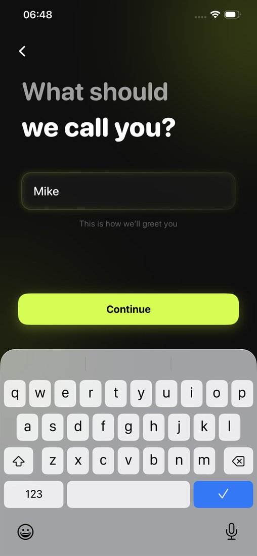
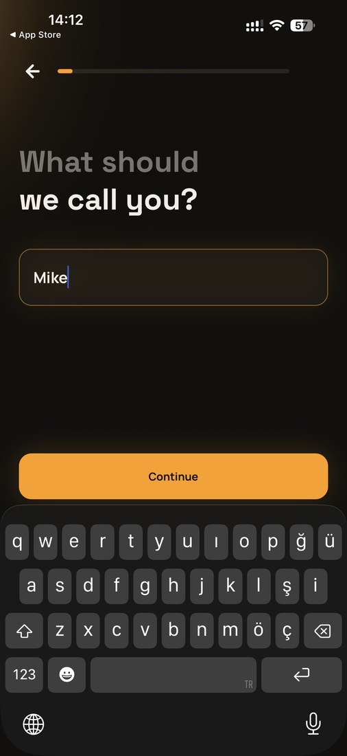
- "What should we call you?"
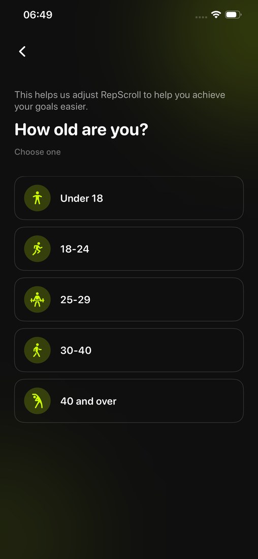
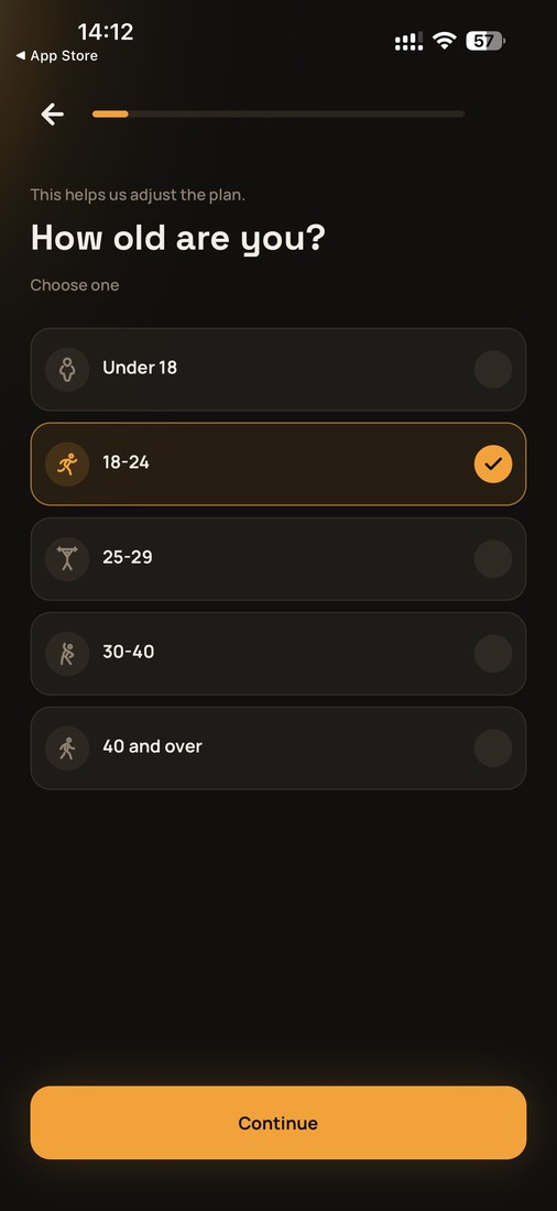
- "How old are you?" / "Choose one"
- "Think about apps like Instagram or TikTok." / "What makes it hard to put them down?"
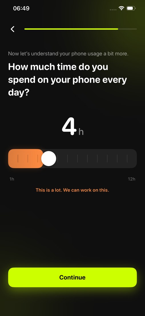
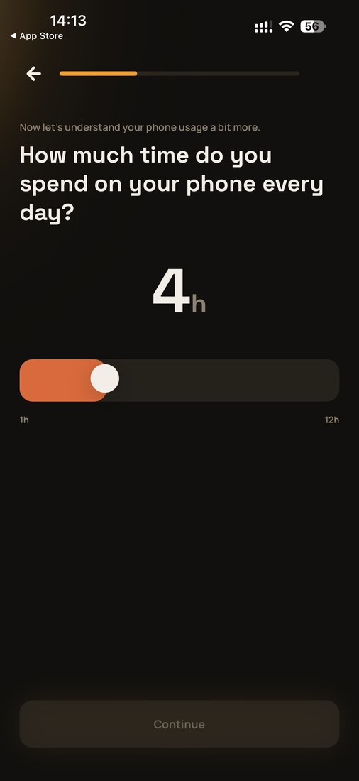
- "Now let's understand your phone usage a bit more." / "How much time do you spend on your phone every day?"
- "Set your daily screen time goal." / "How much would you like to spend?"
- "Select your most distracting apps"
- "Enable Screen Time Access", above an "Allow Screen Time Access" button
- "Mike, let's finish setting up RepScroll" / "Mike, let's finish setting up RepLock"
- The loading caption "Finalizing your plan"
- The eyebrow "YOUR COMMITMENT" above the closing signature screen
None of these sentences has a functional reason to match exactly. There are a hundred ways to ask someone's name.
Numbers that cannot be jointly observed
This is the part we find hardest to explain away. Both apps show a "join a global movement" screen with aggregate usage statistics. Statistics of this kind describe one app's own userbase — two different apps would necessarily have different ones.
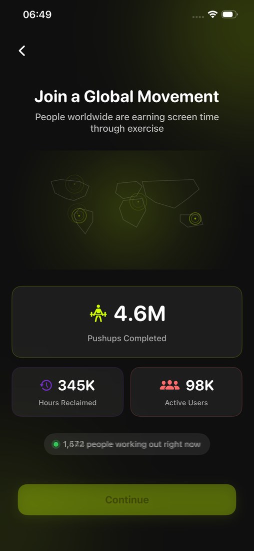
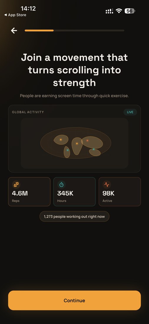
All three figures — 4.6M, 345K, 98K — are numerically identical, in the same order, over the same faint polygon world map. Beneath them, both apps show a live pill built on the character-identical template "<count> people working out right now" — only the count differs.
It does not stop there:
- Both apps state the population average as exactly 33 percent on the phone-dependency chart, with the user's warm-colored bar taller than the cool-colored average bar.
- Both convert exercise to screen time at exactly the same rates: 2 push-ups = 1 minute, 3 squats = 1 minute. These are free balance parameters — any rate would work. (The plank rate differs: 20 seconds against 10. The analysis records that as a divergence.)
- Both default the usage slider to 4h and the goal slider to 2h.
Lists that could have taken any order
The app-selection screen asks which apps pull you in. RepScroll lists twelve entries in a two-column grid: TikTok, Instagram, YouTube, X (Twitter), Reddit, Snapchat, Threads, Netflix, Discord, Twitch, Gaming, Other. RepLock lists the same twelve entries — identical membership, identical order, identical left-right column pairing, closing with the same two non-app entries in the same final positions.
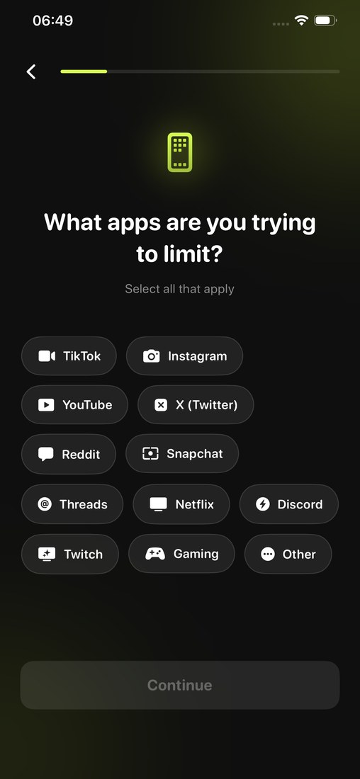
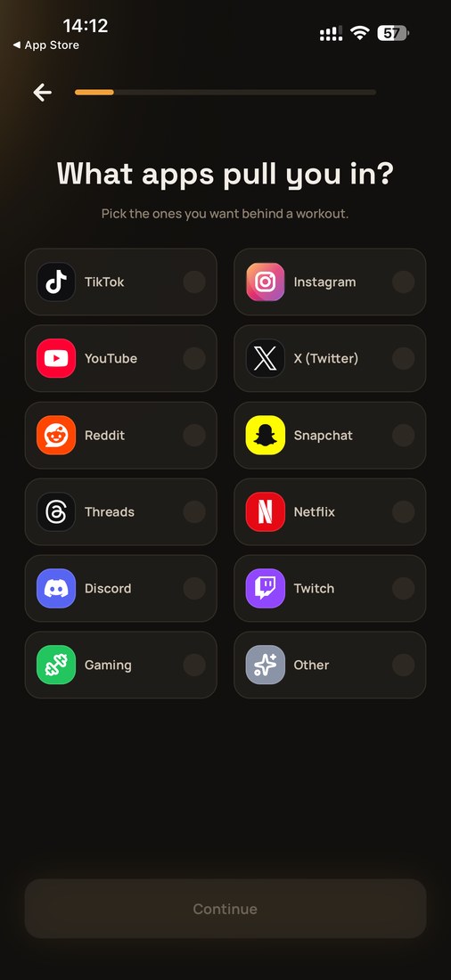
The age screen is the same story. Our brackets are irregular — Under 18, 18–24, 25–29, 30–40, 40 and over. That is not a standard demographic banding two teams would independently land on: one bracket spans seven years, the next five, the next eleven. RepLock uses the same five brackets in the same order.
The navigation bar is a feature list — and it matches
A bottom navigation bar declares which features an app has and how they are grouped. Both apps expose five destinations in the same order:


In the two captures above, all five labels agree. To be precise: the RepScroll capture is from an earlier build — our current build renames the third tab to "Bosses" (you will see that label in the tab screenshots below), so against the current build four of the five labels agree, and both labels denote the same feature.
An exercise-to-unlock app needs none of these beyond Home. It does not entail a chaptered progression path, an adversary ladder of named fictional characters, or a public per-exercise leaderboard — and it certainly does not entail all three. Both apps have all three, in the same three positions of the bar.
Inside the tabs, the anatomy repeats
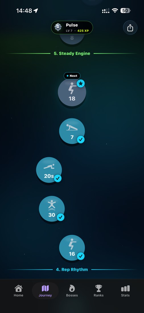
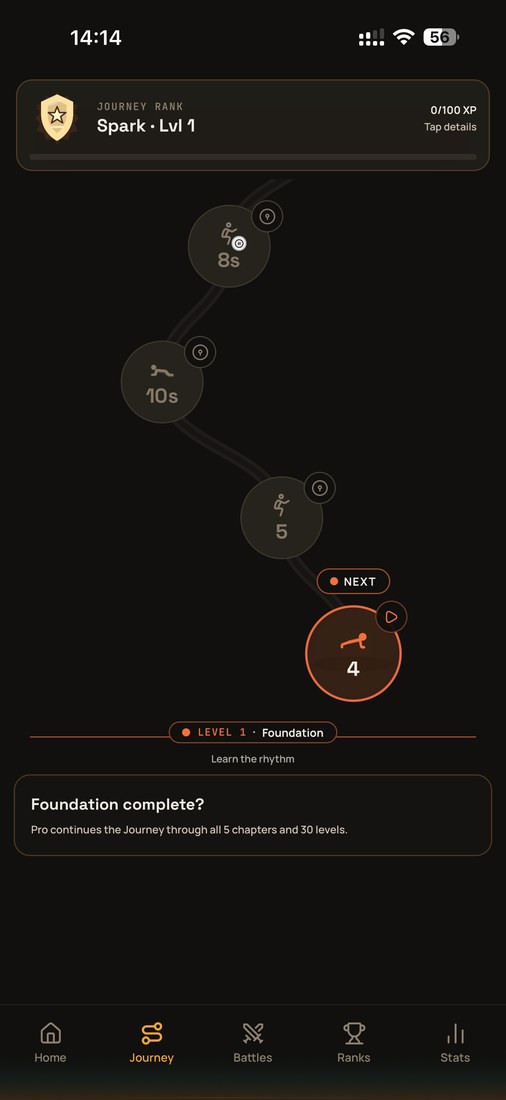
Both Journey tabs open with an invented one-word rank name ("Pulse" and "Spark"), a shield emblem, a level, and an XP counter — then a vertical winding path of circular nodes, each printing a rep count or duration, with a pill marking your current position. RepLock even adopts our term "chapters", and its Level 1 subtitle "Learn the rhythm" echoes our chapter name "Rep Rhythm".
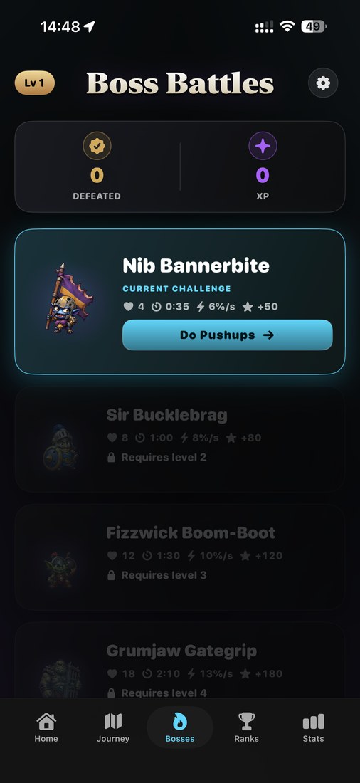
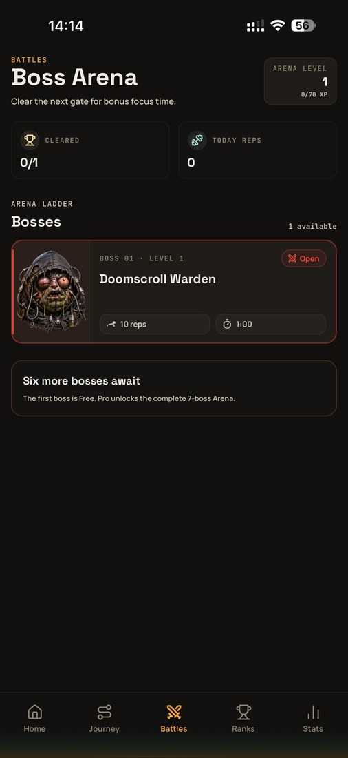
We invented fictional adversaries with names like Nib Bannerbite and Sir Bucklebrag as the object of a repetition target. RepLock ships a Doomscroll Warden with the same card anatomy: illustrated portrait at the left, invented proper name, capitalized status label, an inline row of numeric requirement chips including a timer, and a single action button.
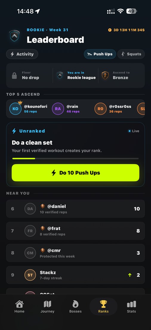
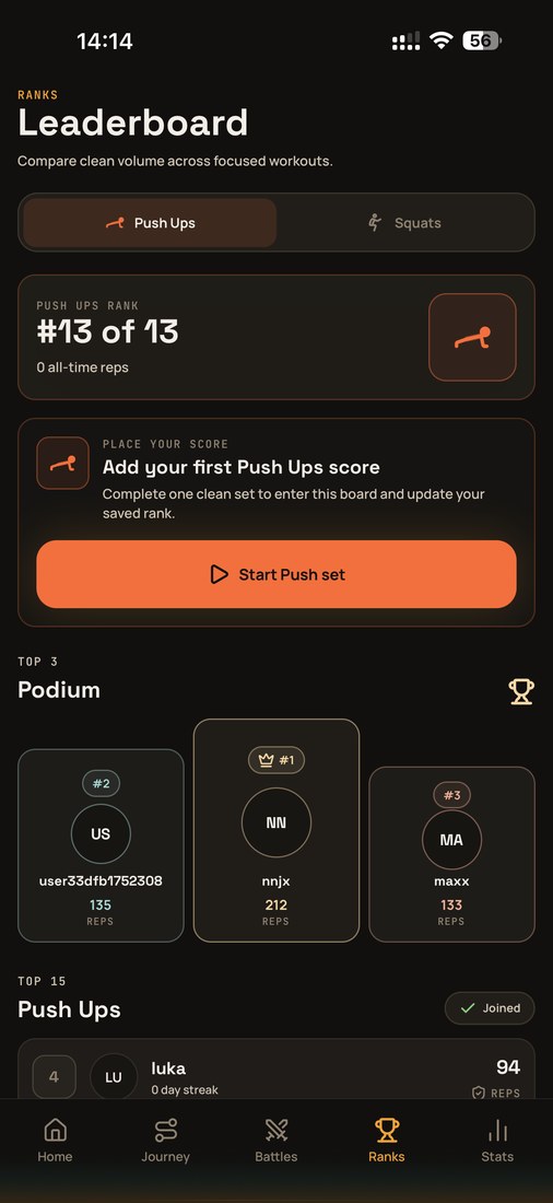
Both rank boards are titled "Leaderboard", both offer a per-exercise segmented control with Push Ups as the default, and both prompt unranked users with the same coinage: "a clean set". RepLock uses the qualifier twice more elsewhere — "clean volume", "clean push-up and squat scores".
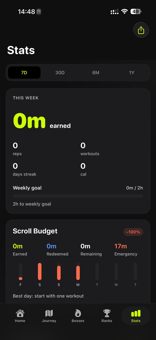
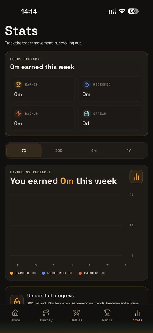
Both Stats tabs use the same four reporting periods with the same abbreviations and the same default, the same "0m earned" phrasing above a two-by-two metric grid with a streak tile, and the same earned-versus-redeemed chart over a seven-bar week that starts on the same weekday. Our fourth budget category, "Emergency" minutes, appears in RepLock as "Backup" — the same reserve-minutes concept, renamed.
Home and settings, same skeleton
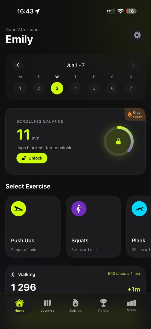
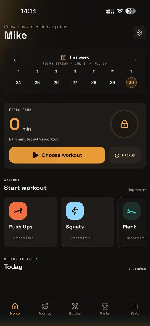
The vertical section order on the home screen is identical throughout: greeting header with a settings control at the top right, horizontal week strip with chevrons, an earned-minutes balance card with a circular lock gauge at the right and the primary action beneath, an exercise carousel — Push Ups, Squats, Plank, in that order — then recent activity, then the five-item navigation bar.
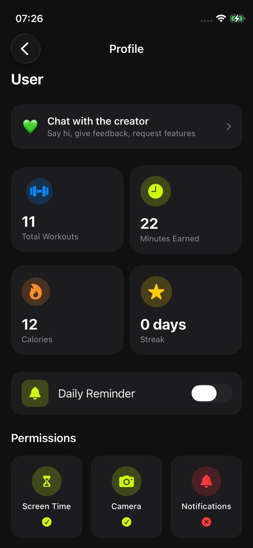
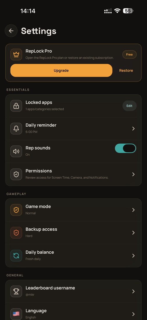
Settings: same grouped-rows-under-section-labels anatomy, a "Daily reminder" row with its scheduled time (character-identical label), and the same three permissions listed in the same order — Screen Time, Camera, Notifications.
Down to the signature
Our onboarding closes with a commitment gate: the eyebrow "YOUR COMMITMENT", then a legalistic first-person sentence — "I, Mike, commit to building healthier habits" — above a signature. RepLock closes with the eyebrow "YOUR COMMITMENT", then "I, Mike, commit to earning my unlock time with push-ups before opening distracting apps."
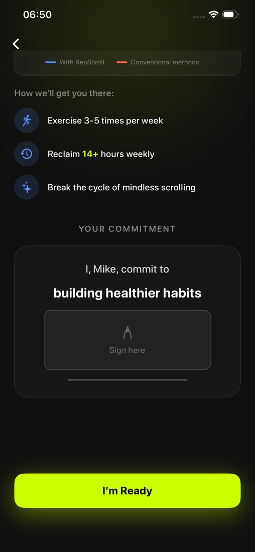
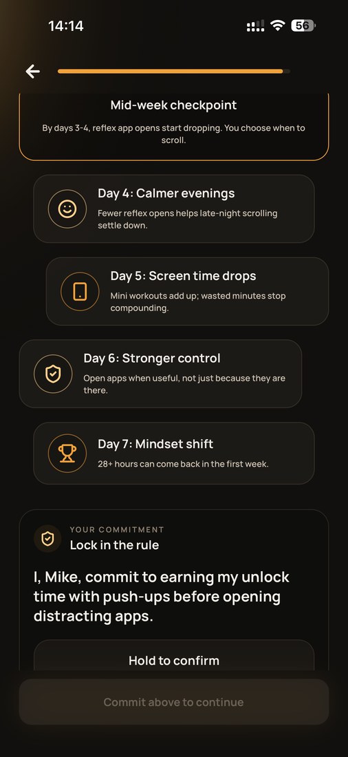
The template "I, <name>, commit to <undertaking>" is the final gate of onboarding in both apps.
What is different — because we recorded that too
A comparison that only lists matches is not evidence, it is advocacy. The analysis records every material difference it found, and there are real ones:
- The plank conversion rate differs: 20 seconds per minute in RepScroll, 10 in RepLock.
- Two screens are transposed: RepLock asks its goals question before the state-transition screen where we ask it after, and it requests notifications before Screen Time access where we do the reverse.
- Several screens are independently reworded around the shared structure, and RepLock compresses rather than omits — a 7-day plan where we show a 66-day path, one processing screen where we show four.
- Notably, no RepLock onboarding screen introduces a feature or narrative step that is absent from RepScroll's flow.
The analysis is also deliberately narrow in scope: it compares the in-app interface only. The store listing, icon, store screenshots, and price screens were left out, and it makes no finding on authorship or intent — it documents the correspondence itself, in a form anyone can independently check against the public app.
Why this matters — again
When we published the FitScroll post, we wrote that small teams spend real time designing the things that look simple from the outside. Two months later we are writing the same thing about a different app.
One identical sentence could be coincidence. One identical default value could be convention. But 16 character-identical sentences, three userbase statistics matching to the digit, a twelve-app list in identical order, irregular age brackets reproduced exactly, the same exercise-to-minute exchange rates, and three non-obvious gamification features sitting in the same three navigation slots — the question is not whether any single observation can be explained. It is whether the whole set can.
Competition is good. Similar categories are normal. We will keep building RepScroll, and we will keep publishing the evidence when this happens — because developers should be able to defend their work publicly, with receipts.